
import streamlit as st
import pandas as pd
import numpy as np
import matplotlib.pyplot as plt
import seaborn as sb

def main() :
    st.title('차트 그리기 1')

    df = pd.read_csv('streamlit_data/iris.csv')

    st.dataframe( df.head() )

    # sepal_length 와 sepal_width 의 관계를 차트로 그리시오.
    fig = plt.figure()
    plt.scatter(data=df, x='sepal_length', y='sepal_width')
    plt.title('Sepal Length Vs Width')
    plt.xlabel('sepal length')
    plt.ylabel('sepla width')
    st.pyplot(fig)

    fig2 = plt.figure()
    sb.regplot(data=df, x='sepal_length', y='sepal_width')
    st.pyplot(fig2)

    # 히스토그램
    # petal_length 로 히스토그램 그리기

    fig3 = plt.figure()
    plt.hist(data=df, x= 'petal_length', bins=10, rwidth=0.8)
    st.pyplot(fig3)

    fig4 = plt.figure(figsize= (10,4))
    plt.subplot(1, 2, 1)
    plt.hist(data=df, x= 'petal_length', bins=10, rwidth=0.8)

    plt.subplot(1, 2, 2)
    plt.hist(data=df, x= 'petal_length', bins=10, rwidth=0.8)
    st.pyplot(fig4)

    ### 우리가 주피터 노트북에서 그렸던,
    ### plt 차트나 sb 차트는
    ### 스트림릿에서 표시하려면,
    ### plt.figure()로 먼저 영역을 잡아주고.
    ### st.pyplot() 함수로 웹화면에 그려준다.

    ### 그리고, 데이터프레임의 내장 차트도, 마찬가지로 해준다.

    # df 의 species 컬럼의 각 종별로 몇개의 데이터가 있는지
    # 차트로 나타내시오.
    fig5 = plt.figure()
    df['species'].value_counts().plot(kind = 'bar')
    st.pyplot(fig5)

    fig6 = plt.figure()
    df['petal_length'].hist()
    st.pyplot(fig6)

if __name__ == '__main__' :
    main()
----------------------------------------------
import streamlit as st
import numpy as np
import pandas as pd
# plotly 라이브러리
import plotly.express as px
# altair 라이브러리
import altair as alt
def main():
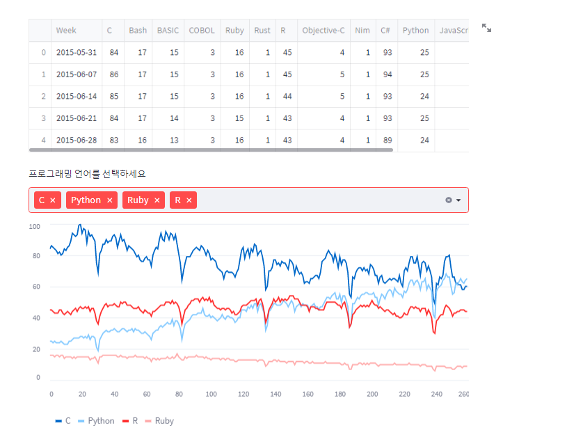
df = pd.read_csv('streamlit_data/lang_data.csv')
st.dataframe(df.head())
column_menu = df.columns[1:]
choice_list = st.multiselect('프로그래밍 언어를 선택하세요', column_menu)
if len(choice_list) != 0 :
# 유저가 선택한 언어만, 차트를 그린다.
df_selected = df[choice_list]
## 스트림릿에서 제공하는 라인차트
st.line_chart(df_selected)
## 스트림릿에서 제공하는 영역차트
st.area_chart(df_selected)
## 스트림릿에서 제공하는 바차트
st.bar_chart(df_selected)
df2 = pd.read_csv('streamlit_data/iris.csv')
### altair 라이브러리의 mark_cicle 함수 사용법
chart = alt.Chart(df2).mark_circle().encode(
x='petal_length',
y='petal_width',
color = 'species'
)
st.altair_chart(chart)
### 위치 정보를 지도에 표시하는 방법
### 스트림릿의 map 차트
df3 = pd.read_csv('streamlit_data/location.csv', index_col=0)
st.dataframe(df3.head())
st.map(df3)
if __name__ == '__main__' :
main()
### plotly 의 pie 차트 그리는 방법
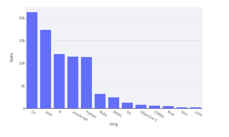
df4 = pd.read_csv('streamlit_data/prog_languages_data.csv', index_col=0)
st.dataframe(df4.head(3))
fig6 = px.pie(df4, 'lang','Sum',title='각 언어별 파이차트')
st.plotly_chart(fig6)
### plotly 의 bar 차트 그리는 방법
df4_sorted = df4.sort_values('Sum',ascending=False)
fig7 = px.bar(df4_sorted , x='lang',y='Sum')
st.plotly_chart(fig7)'DataScience > Streamlit' 카테고리의 다른 글
| Streamlit 웹대시보드 ec2 백그라운드 실행 (0) | 2023.04.29 |
|---|---|
| Streamlit 을 이용한 자동차 가격예측 웹 대시보드 연습 (0) | 2022.12.13 |
| Streamlit 파일 분리 앱(사이드 메뉴바 이용 ) (0) | 2022.12.13 |
| Streamlit 웹에 파일을 업로드 하는방법, 서버에 저장하는방법 (0) | 2022.12.13 |
| Streamlit 웹대시보드 이미지,동영상,title, button, text, dataframe, multiselect, slider (0) | 2022.12.12 |


